Hassle-free automated assessments
Our older test creation flow had several inherent problems associated with it:
1. Profile driven
Earlier to this, we had test creation based on job profiles (role-based), which was restrictive as the skills were tightly coupled to the roles and were not customizable by the recruiters. For example, I could select a profile say front-end engineer and the questions generated will only be from HTML, CSS and Javascript. So, if a recruiter wanted to generate questions for a front-end engineer profile to test React skill, they had to add them manually from our questions library or theirs.
2. Complex UI
The older interface was filled with unwanted form elements and had almost no provision to support newer question types. We somehow missed to provide a scalable and an intuitive step-by-step test creation flow that catered to the needs of our non-technical recruiters.
3. Rigid algorithm
The algorithm we used for selecting the test questions was relatively rigid, so there was a limited scope in picking questions from a mix of skills and of varied difficulties, either from the HackerEarth’s questions library or from the company’s library or both.
4. Restricted question types
Though there was a demand from our customers to include additional question types such as SQL, front-end project and Java project questions to the test creation flow, we could not accommodate them as the interface was already bloated.
Design
Based on the customer feedback and research data, it was important for us to improve the old flow in accord to the correct persona of our users. More focus was put on enterprise talent acquisition teams. We found out that in general scenario, such teams are bound by the following:
- Want - To hire good people with minimum effort and time
- Capabilities - Familiar with the technical terms and the skills needed for a role
- Limitations - Have low technical knowledge
The new design was implemented keeping in mind all the requirements by our star designer, Neha Singh. The idea was to keep the interface minimal and distraction free, so to attenuate the cognitive load for the recruiter.
Benefits of the new design
- Skill-driven approach to test candidates better when auto-generating a test in HackerEarth Assessments
- Scalable system
- Better user controls and flexibility
- User friendly jargons and actions
- Focuses on persona of a non-tech test administrator
Features of the new flow
The new skill-based test creation flow involves a stepwise process where bare minimum inputs from a user are taken to auto-generate a test. Primarily, the flow is divided into two screens:
Screen #1
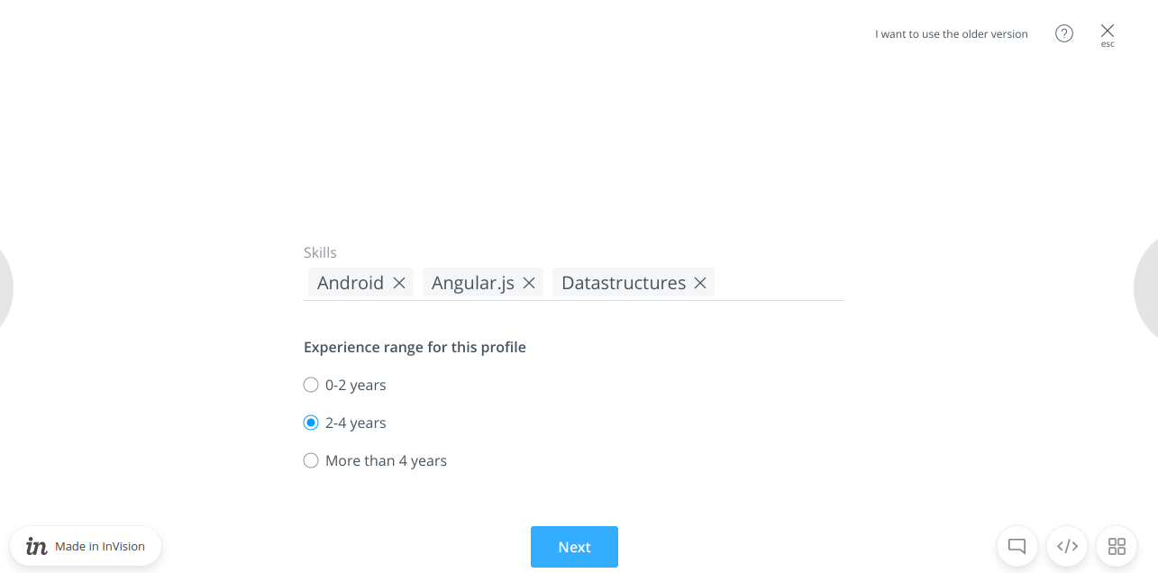
- Skills dropdown - Since the definition of profile required by different companies and geographies do not overlap, skill is the primary domain used for tests by the recruiters.
- In the new flow, users can search for a set of skills they desire. The list will be in alphabetical order and will auto-suggest on typing
- Multiple skills can be selected
- The recruiter should select atleast one skill to auto-generate a test
- Experience - Years of experience is one of the prime components in a job description. We are starting out with the following options and based upon the customers’ feedback, we may alter or add more in the next version.
- 0-3 years
- 4-6 years
- More than 6 years
The default selected option would be 0-3 years of experience.
The above mentioned inputs are sufficient to auto-generate a test.
Screen #2
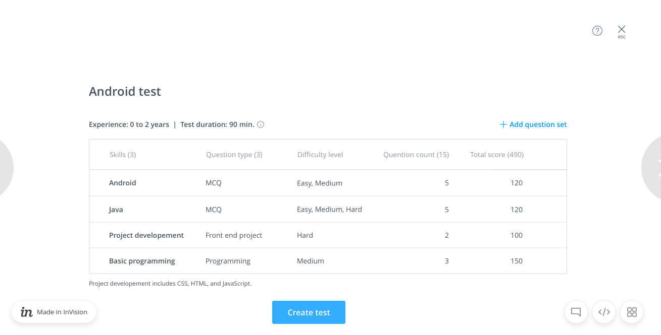
After selecting the skills and experience, the user is shown the summary of the questions selected using our algorithm. They can simply click on the “Create Test” button to get the task done. The following information would be shown, in case they want to edit any information:
- Test name
- Default name is based on the first selected skill appended by the text “Test” i.e.
<First skill name> Test. This was an assumption based on the philosophy that the recruiter would usually choose the first skill as the most important one. This implementation helped to reduce the effort needed to type the heading always - The name would be inline editable
- The interface will not allow to have empty test name
- Default name is based on the first selected skill appended by the text “Test” i.e.
- Experience
- This cannot be changed in this step
- Assumption is that the need for it would be only in case of a wrong selection in the first step. Therefore, the user has to start afresh if they want to change the value.
- Duration
In general scenario, with our unique algorithm, the default test duration would be 90 minutes. This would change:- When a question set is deleted
- When a question set is edited
- When a question set is added
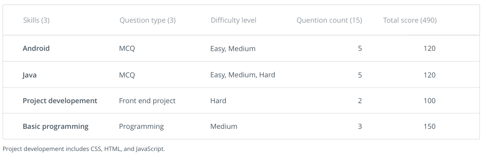
- Test summary table
- Number of skills selected and the question type count in a question set
- The user can edit or delete an already added question set
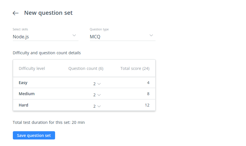
- The user can add a new question set. For adding a set, the user is asked to select the following information in a sequence in a separate screen:
- Skill such as Java, Python or Basic Programming
- Question type such as MCQ or Programming
- Difficulty levels viz. easy, medium and hard
- Count of questions for each difficulty level
What we build
The new skill-based test creation was a complex implementation. Around 5,000+ lines of code was added to get the feature up and running without bugs. I would try to be precise in explaining the front-end engineering behind it.
The app architecture
The app was built using React v15+ (now using v16.8.5) and Redux. The modules were bundled using Webpack. We maintain a default config for all our Webpack apps. So, to create the config for new test creation app, the following changes were added:
const testCreationConfigGenerator = new WebpackConfigGenerator({
    name: "test-creation",
    entryPath: "./src/test-creation/index.js",
    extractBundles: [
        {
            name: 'vendors',
            criteria: isExternal,
        },
    ]
});
WebpackConfigGenerator is our in-house implementation. It is a class consisting of various methods to handle the default configuration such as entry, output and module loaders. The isExternal criteria checks if the modules are from node_modules directory or any other external library. So, with the above config, we get 2 JS files viz. test-creation.js and vendors.js and dependent CSS files.
Building the interface
Based on the new interface, the following components were required:
Disabled create test link
We have planned to restrict the new skill-based test creation to few customers at first. Moreover, in case of API or server failure, a recruiter should not have access to the test creation modal but should be able to create a blank test. Hence, separated out this component.
Modal
We already had a full width modal component and planned to use that.
Custom select dropdown with tags
This was built over the React Select package.
render() {
    return (
        <div className='select-dropdown-container'>
            <div className="form-field">
                <Select
                    name={this.props.name}
                    value={this.state.value}
                    options={this.props.options}
                    onChange={this.handleSelectChange}
                    onFocus={this.onFocus}
                    multi={!!this.props.multi}
                    required={this.props.required || false}
                    disabled={this.props.disabled}
                    searchable={this.props.searchable}
                    filterOptions={this.props.filterOptions}
                    noResultsText={this.props.noResultsText || NO_RESULTS_FOUND}
                    openOnFocus={this.props.openOnFocus || true}
                    tabSelectsValue={this.props.tabSelectsValue || false}
                    clearable={this.props.clearable || false}
                />
                <label className={this.props.labelClass} htmlFor={this.props.name}>
                    {this.props.label}
                </label>
            </div>
        </div>
    );
}
The prominent aspect was to create a separate component for options dropdown. The Select component provided by the package, expects a prop optionComponent. The component CustomSelectOption was used for that. It was responsible for handling mouse events like mousemove, mouseenter and mousedown. The options object, containing the selected status of every option, was provided as props by the parent component SkillsInputContainer.
SkillsInputContainer was responsible for handling skills and experience selections, providing a link to create a blank test and showing statuses such as “You can add more than one skill to your test” and “Maximum number of skills selected. Please remove existing skills to add more”.
We use Stylus for writing CSS. We already had custom design for input fields, but the design for this particular use case was a bit different. As we were using common code from the React Select package, we had to overwrite most of the default CSS code to make the component as per the design.
.form-field
    .Select
        &.Select--single
            &.has-value
                > .Select-control
                    .Select-value
                        .Select-value-label
                            width: auto;
        &.is-focused, &.is-open
            ~label
                font-size: 10px
                top: -12px
                color: $brand-dark-gray
        &.Select--single
        &.Select--multi
            .Select-control
                padding: 0
                box-shadow: none
                .Select-placeholder
                    opacity: 0
                .Select-input
                    margin-left: 0
            &.is-open
                .Select-control
                    border-bottom: 1px solid rgba(0,153,255,0.8)
            .Select-value
                border: none
                color: $brand-dark-gray
                padding-left: 0 /* Overwrites default */
                top: 4px /* Overwrites default */
            .Select-value-label
                float: left
            .Select-value-icon
                border: none
                &:hover
                    color: white
                    background-color: $brand-blue
                    font-weight: 400
            .Select-clear-zone
                display: none
        .Select-menu-outer
            border: none
            box-shadow: 0 2px 10px 0 rgba(0, 0, 0, 0.1)
            border-radius: 0
            .Select-menu
                .Select-option
                    font-size: 16px
                    box-sizing: border-box
                    border: 0
                    color: $brand-dark-gray
                    cursor: pointer
                    display: block
                    padding: 5px 10px
                    max-height: initial
                    &.is-focused
                        background-color: $hover-blue
                        font-weight: 400
                        color: $brand-dark-gray
        .Select--single
            .Select-control
                .Select-value
                    font-weight: 400
                    background-color: #fff
                    padding: 0
                    .Select-value-label
                        font-size: 14px
                        color: $brand-dark-gray

        .Select-placeholder
            padding: 0

        // Handle fliping of arrow (caret)
        &.is-open
            > .Select-control
                .Select-arrow
                    top: 4px // Half the height of caret
                    border-color: $brand-gray
                    border-width: 1px 0 0 1px
Editable heading
By default, the test name is created using the first skill selected by the user. In case the recruiter wants to edit the test name, they can click the heading and edit. This component also handles the case if the recruiter clears the test name. In such case, the default name populates again immediately when the input is focused out.
Alert
Notifies which question set was updated along with the test duration update.

Test summary container
We used our own UI framework, Nuskha, for building out tables. We had to follow a particular HTML structure to build the required table.
Basic structure to generate a table with 2 rows:
<table class="he-table he-table-hover">
<thead>
<tr>
<th><span>Skills (1)</span></th>
<th><span>Question type (2)</span></th>
<th><span>Difficulty level</span></th>
<th class="align-right"><span>Question count (19)</span></th>
<th class="align-right"><span>Total score (128)</span></th>
</tr>
</thead>
<tbody>
<tr>
<td class="weight-600">Algorithms</td>
<td>MCQ</td>
<td>Easy, Medium, Hard</td>
<td class="align-right">17</td>
<td class="align-right">58
<div class="action-icons-container hidden">
<div class="vertical-align-middle inline-block edit-set"><i class="icon ui-pencil" style="font-size: 12px;"></i></div>
<div class="vertical-align-middle inline-block delete-set"><i class="icon ui-trash" style="font-size: 12px;"></i></div>
</div>
</td>
</tr>
<tr>
<td class="weight-600">Algorithms</td>
<td>Programming</td>
<td>Easy, Medium</td>
<td class="align-right">2</td>
<td class="align-right">70
<div class="action-icons-container hidden">
<div class="vertical-align-middle inline-block edit-set"><i class="icon ui-pencil" style="font-size: 12px;"></i></div>
<div class="vertical-align-middle inline-block delete-set"><i class="icon ui-trash" style="font-size: 12px;"></i></div>
</div>
</td>
</tr>
</tbody>
</table>In the above code snippet, action-icons-container contains two icons blocks viz. edit and delete. The delete icon is used to load a popup component for confirmation while the edit icon will take the recruiter to edit the existing question set.
Question set table
For recruiters, we had kept the options to edit an existing question set and add a new question set. While editing or creating a question set, they can update skills, question type such as MCQ and Programming, and question counts for each difficulty level. The interface take care of the duration update.
If a recruiter is mistakenly trying to override and existing set, we prompt them for confirmation to save the hassles.
The secret sauce
The algorithm that we use to populate initial set of questions is a complex one. We use parameters such as experience levels, skills selected by the recruiter, difficulty levels, and types of skills selected to display a summary table with appropriate question sets.
Our internal algorithm tries to create a test of 90 min duration first, however if there are not enough questions then it will fall back to 75, 60, 45 minutes in that order. These are the durations with which we had started and had the following restrictions or limitations:
- It will never auto-generate a test with duration less than 45 min
- A test’s actual configuration can be displayed +5 or -10 min
- If too many skills are added the duration can go beyond 90 min
- The duration would alter if the initial load of skill set is changed
Of course, the above logic is just the tip of the logics ice-berg that we use to auto-generate a skill-based test.
Aspirations
With this feature in place, we aspire to add a few differentiating aspects to it as well.
- Give the option to save a custom profile, based upon the skills selected
- Auto-select the languages in which the candidate can code while generating test questions
- Warn if sufficient questions are not added or if too many questions are present
- Suggest skills based on the current skill selected in the dropdown while configuring a test
- Allow the user to request for the skill from the interface in case the skill is absent in the platform
- Ability to create random sets
- Ability to use questions from the recruiter’s library
- Ability to change the years of experience in the test summary page
…
I will also take this opportunity to thank one of the great engineers that I have worked with, Jagannadh Vangala aka Jaggu for being the perfect ally in diligently completing this project together.
Adios amigos!
Posted by Chandransh Srivastava