Introducing Nuskha
History
We at HackerEarth created a single-page document with common and special CSS classes to make layouts, grids, buttons, inputs, tables, tooltips, and form elements in late 2017. That was our first attempt to develop on our own front-end framework.
Old Nuskha screens:
Framework is a platform, foundation on which ready software solutions are built, in this particular case – web interfaces. For this purpose front-end framework consists of ready components, which are used by a developer when working on a project. What is more, aforementioned components, if necessary, can be modified or adjusted to current needs. - Merix Studio
Our development was inspired from Bootstrap. But, we still had miles to go before calling it a framework.
To be a part of something that will impact the whole organization was exciting for the bunch of us. After rejecting Kriya Kalaap, Kalakari, Retro, Tattva, Lipstick, and many more, we named our nascent framework Nuskha.
“The name ‘Nuskha’ is inspired by one of the art deities "Nuska" from the Mesopotamian mythology. The word ‘Nuskha’ is a Hindi word which translates to ‘formula’ in English - a formula to create or build something.”
Old Nuskha helped but was still inefficient. We did not have any React components. We had started developing one of our products in React (version 16+) while the other product was in the transitioning phase. With strict deadlines for other important tasks, we were unable to contribute much to Nuskha and inevitably the implementation of the same components in different projects was duplicated. We needed a better framework to unify the components. We needed it for consistency, ease of use, and faster development. Yes, we also wanted to DRY up our code base.
Fast forward to few months, as the tradition at HackerEarth goes, we had our internal hackathon scheduled. The timing was perfect. I paired up with Akanksha, another Frontend Engineer at HackerEarth, this time to build Nuskha 2.0 which will eventually be known as Nuskha.
The pain points we solved
During one of our Product All-Hands meeting, we learned about the ‘easiest’ way to use our own HackerEarth icon fonts that had been created recently. The process was as follows:
- A designer gives the Invision file to the developer.
- The developer copies the unicode for the icon that they intend to use.
- The developer then searches the icon class in the PDF file (which contains the icons list) provided to them.
These steps needed to be repeated for every icon, which was incredibly frustrating and time-consuming!
There were multiple small React applications being made simultaneously in the team. One of the code reviews revealed that we had been duplicating a lot of code for React components and other small functionalities. The maintenance of design consistency always required extra inputs in the code base. This was frustrating too.
A small change needed in the font size or color required thorough inspection from a developer and then a proper regression testing. This consumed a lot of time and effort and slowed down the release cycle.
What we built
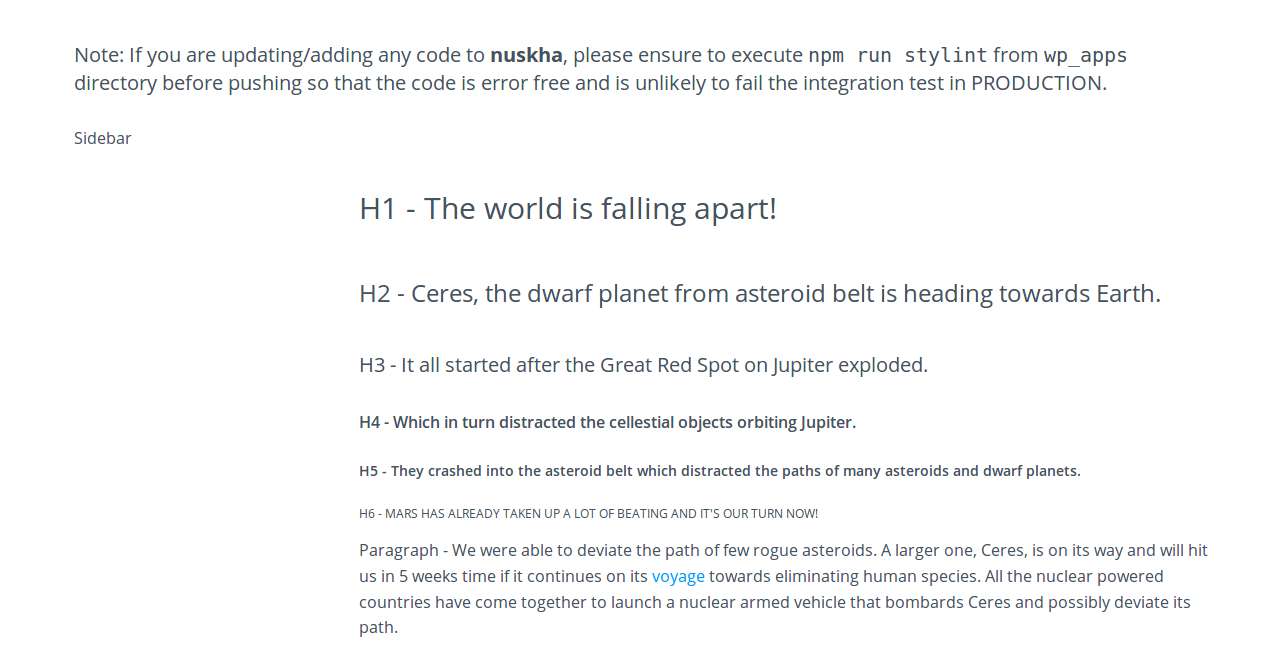
The idea was simple. We wanted to create a Single Page Application (SPA) where all the common React components would be linked in the sidebar. Their individual pages would give details about how to use them along with React and HTML codes. Their expected props and associated details would be shown in the table. We had our own icon fonts. We wanted to make these components and icons searchable. The basic interface design was to have a header, sidebar, and body section.
Creating the app architecture
We used create-react-app, an excellent package from Facebook, to get started with our application.
But soon, we ran into a problem. While writing the components’ methods, we were accustomed to using different decorators. One of them was autobind from core-decorators. To use decorators, a config change was required in Babel because these decorators are not available natively. Facebook’s create-react-app has a limitation in this case.
Every time I used to start the webpack server, a new tab in browser would open. This was irritating because I already had a previous tab with the same address. We also wanted some configuration change to handle .styl files and finally decided to eject the default configuration.
After ejecting the default config, we updated our packages and the Babel config to get the decorators up and running.
For enabling the browser tab open by default, the app used open browser util (react-dev-utils/openBrowser). It was used in the start.js inside the scripts directory. While configuring the devServer.listen method, the call to open the browser method was commented out. This gave us the desired result.
Building the pages
We started building different pages for common components such as buttons and icons. We tried to make development as modular as possible during the Hackathon. For the routes, we even separated the URLs of the pages in a file.
Every page was supposed to show all the use cases of the component as examples. For example, in case of buttons, we showed all the 13 different types of buttons. Another important task was to display all the proptypes. This was displayed in a table, which was another common element.
We were building these pages for developers, and therefore, the most important section was how to use these components. We planned to show the implementation of the component along with the code. Earlier, we thought of providing editable code but later went on to implement multiple read-only editors due to limited time and to avoid confusion.
We implemented two editors. One showed a pure HTML implementation while the other showed the React implementation. To implement the editor, we used the Brace editor. The basic config for the React editor was as follows:
<AceEditor
    value={value}
    mode='html'
    theme='crimson_editor'
    height={height || '250px'}
    readOnly
    showGutter={false}
    highlightActiveLine={false}
    highlightGutterLine={false}
    showPrintMargin={false}
    wrapEnabled
    fontSize={14}
    setOptions={{showLineNumbers: false}}
    editorProps={{$blockScrolling: true}}
/>
This editor had a wrapper which included only one functionality–the Copy button. To implement the copy functionality, we faked a textarea with the desired content. A click on the button transitioned the text value to ‘Copied’ for less than a second if the content was successfully copied to the clipboard. Once all these were done, the page was made accessible from the sidebar.
Icons directory
We wanted to implement a searchable list of icons. We used another common component, card, to list the icons. A card component is a simple rectangular box with shadows. It showed the icon and its details required to use it as an HTML or a React component. We created an icon React component also.
There were 576 icons. To make the listing modular, we created an icons map file. This file contained the details of the CSS content and name of each of the icons. To make searching easy, we introduced tags. Tags contained a list of synonyms or related words for the icons names. For example, an icon with name “safety-locker” had “almirah, cupboard, and cabinet” as the tags. The React component created for an icon, expected name of the icon. It was also configurable via props for color, size, tooltip, and click handler.
To make the search bar, an Input component that was already available was used. It was a controlled React component. The onChange handler, updated the state. The logic for list update is as follows:
const {iconsMap, searchInput} = this.state;
let filteredIconsMap = null;
function checkIfStringPresent(stringToCheck) {
  return stringToCheck.toLowerCase().indexOf(searchInput.toLowerCase()) > -1;
}

if(searchInput.length > 0) {
  filteredIconsMap = iconsMap.filter(function(icon) {
    return (checkIfStringPresent(icon.name)
      || checkIfStringPresent(icon.tags.toString())
      ||  checkIfStringPresent(icon.character));
  });
} else {
  filteredIconsMap = iconsMap;
}
const filteredIconsList = filteredIconsMap.map(function(iconData, i) {
  return (
    <Card key={i.toString()} klass='icons-container align-center'>
      <HEIcon name={iconData.name} size='30px' />
      <p className='align-left padding-top-10 no-margin'>
        Class: {iconData.name}
      </p>
      <p className='align-left no-margin'>
        Character: {iconData.character}
      </p>
      <p className='align-left no-margin'>
        Tags: {iconData.tags.toString()}
      </p>
    </Card>
  );
});
The icons map had a name, character, and tags. So, whenever an input was given, all the three were searched. A filtered list was created, then that list was mapped (filteredIconsList) to create the list of icons. We were wary of the performance, but it worked smoothly.
End product
Future scope
- More components
- More utility functions
- Open source
We have recently converted our legacy search bar code written in jQuery into a React component following the Redux architecture. We had to rewrite most of the functionalities because of the complex code. However, now the component is ready to be added to our internal products.
On 1st June, I pushed a couple of helper functions to check if all the keys in a JavaScript object have boolean true values and to compare two JavaScript objects for equality. Not only are we making it a better front-end framework for web interfaces but also adding potential generic code that we might need in multiple products day-by-day.
I am happy to know that, Nuskha, which started as a hackathon product, is now evolving into something bigger and better.
Adios amigos!
Posted by Chandransh Srivastava